New Features in Maple 2018 - Visualization- Maplesoft

What's New in Maple 2018

Visualization


Maple provides an extensive suite of visualization tools for plots and animations, with over 200 plot types and options.  Plots can be created and modified interactively and through commands. Maple 2018 includes a variety of improvements to visualization in Maple. 


Borderless Arrows

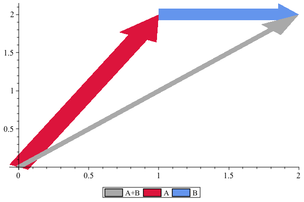
A frequently requested item, plottools:-arrow and plots:-arrow both have a new option, border, that controls the display of the border around the arrow. 

The following example shows the addition of two vectors, A and B

> plots:-display(plottools:-arrow([0, 0], [2, 2], 0.5e-1, .2, .1, border = false, color =
plots:-display(plottools:-arrow([0, 0], [2, 2], 0.5e-1, .2, .1, border = false, color =
 

Plot_2d
 

Computational Geometry 

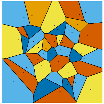
Several commands in the ComputationalGeometry package can generate dynamic visualizations including the following Voronoi Diagram: 

Additional plot settings can be controlled using commands such as plots:-setcolors. 

> ComputationalGeometry:-VoronoiDiagram(LinearAlgebra:-RandomMatrix(40, 2), showpoints, symbol = solidcircle, symbolsize = 7, colorregions = ColorTools:-GetPalette(
ComputationalGeometry:-VoronoiDiagram(LinearAlgebra:-RandomMatrix(40, 2), showpoints, symbol = solidcircle, symbolsize = 7, colorregions = ColorTools:-GetPalette(
Plot_2d
 

Plot Builder 

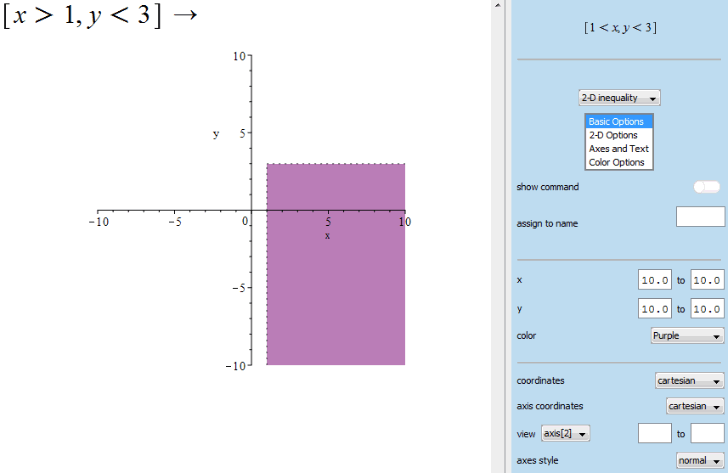
The PlotBuilder provides an easy mechanism for creating and customizing a wide variety of plots. In Maple 2018, you can now use the Plot Builder to generate plots for inequalities. 
Image 


Rotatable Text 

Rotatable tickmarks

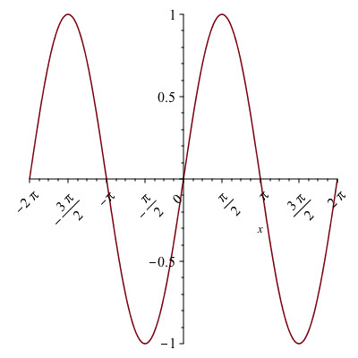
Tickmarks in plots have a new suboption, rotation, which makes it possible to rotate the angle of the tickmarks. 

> plot(sin(x), axis[1] = [tickmarks = [rotation = `+`(`*`(`/`(1, 4), `*`(Pi)))]]); 1
Plot_2d

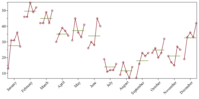
Several plots have been updated to use this by default, including plots from the TimeSeriesAnalysis package: 


> ts2 := TimeSeriesAnalysis:-TimeSeries([7, 23, 21, 19, 13, 46, 42, 30, 31, 26, 19, 9, 16, 26, 17, 33, 31, 46, 42, 35, 45, 30, 11, 17, 23, 20, 15, 36, 31, 55, 49, 39, 36, 28, 12, 11, 21, 23, 27, 33, 36,...
ts2 := TimeSeriesAnalysis:-TimeSeries([7, 23, 21, 19, 13, 46, 42, 30, 31, 26, 19, 9, 16, 26, 17, 33, 31, 46, 42, 35, 45, 30, 11, 17, 23, 20, 15, 36, 31, 55, 49, 39, 36, 28, 12, 11, 21, 23, 27, 33, 36,...

Typesetting:-mprintslash([ts2 := Vector(4, {(1) = Typesetting:-mi(

>
TimeSeriesAnalysis:-SeasonalSubseriesPlot(ts2, startingperiod = 9, seasonnames = [

Plot_2d

Rotatable textplot

The plots:-textplot command has also been updated to accept the rotation option. 

plots:-textplot([1, 1,  

Plot_2d

Statistics - ParetoChart

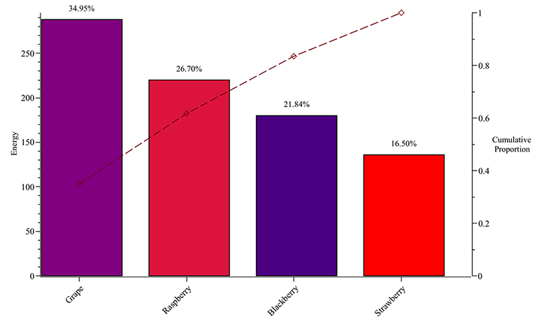
The ParetoChart command generates a plot of a tagged histogram of decreasing values and a curve indicating the percentage cumulative sum of the values. 

>

DF := DataFrame(`<|>`(`<,>`(220, 288, 136, 180), `<,>`(11.94, 18.1, 7.68, 9.61), `<,>`(543421, 58500118, 4594539, undefined), `<,>`(Russia, China, USA, Mexico), `<,>`(

Typesetting:-mrow(Typesetting:-mi(

> Statistics:-ParetoChart(DF[Energy], columngraphoptions = [color = sort(DF, Energy, `>`)[Color], labels = [

Plot_2d